building of distinction
WHILE THE Medac build-ing’s
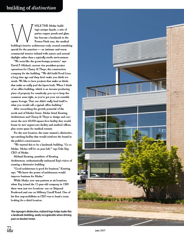
unique façade, a mix of
patina copper panels and glass,
has become a landmark in the
Porters Neck area, the medical
building’s interior architecture truly created something
special for the practices — an intimate and warm
commercial interior infused with nature and natural
daylight rather than a typically sterile environment.
“We sorta like the goose-bumpy projects,” says
David F. Michael, current vice president-project
operations for Clancy & Theys, the construction
company for the building. “We did build Food Lions
a long time ago and they don’t make you think too
much. We like to have projects that make us think,
that make us really peel the layers back. When I think
of an office building, which is an income-producing
piece of property for somebody, you try to keep the
common areas tight, so you’ve got your net rentable
square footage. That one didn’t really lend itself to
what you would call a typical office building.”
After researching the growth potential of the
north end of Market Street, Medac hired Kersting
Architecture and Clancy & Theys to design and con-struct
the new 60,000-square-foot facility that would
house its new urgent-care facility and medical offices,
plus create space for medical tenants.
For the new location, the team wanted a distinctive,
eye-catching facility that would reinforce the brand in
the public’s consciousness.
“We wanted this to be a landmark building. ‘Go to
Medac. Medac will be on your left,’” says Dale Key,
CEO of Medac.
Michael Kersting, president of Kersting
Architecture, enthusiastically embraced Key’s vision of
creating a distinctive building.
“Good architecture is good for business,” Kersting
says. “We knew the power of architecture would
improve business for Medac.”
While Medac now sees patients at six locations,
when Key joined the 15-year-old company in 1999
there were just two locations: one on Shipyard
Boulevard and one on Military Cutoff Road. One of
his first responsibilities as CEO was to head a team
looking for a third location.
The signage’s distinctive, stylized logo helps make this
a landmark building, easily recognizable when driving
past on Market Street.
72
WBM june 2017