buildings of distinction
39
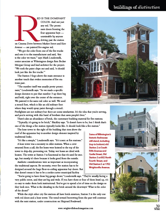
ED IS THE DOMINANT
COLOR. And not just
any red. The promi-nent
doors fronting the
four apparatus bays —
unmissable by anyone
driving past the station
on Cinema Drive between Market Street and Kerr
Avenue — are painted fire engine red.
“We got the color from one of the fire trucks
and sent it to the manufacturer and said, ‘this
is the color we want,’” says Mark Loudermilk,
senior associate at Wilmington design firm Becker
Morgan Group and lead architect for the project.
“We took the paint chips out and said, ‘it should
look just like the fire trucks.’”
The Station 3 logo above the main entrance is
another touch that evokes memories of fire sta-tions
past.
“The number itself was usually pretty promi-nent,”
Loudermilk says. “So we made a specific
design decision to put that number 3 up there big
and bold, right over the center of the entrance.
We painted it the same red color as well. We used
a stencil font, which is like an old military font
where they would spray paint through a stencil.
Firefighters are not military but there are some similarities. It’s the idea that you’re serving,
and you’re serving with this band of brothers that saves people’s lives.”
There’s also an abundance of brick, the customary building material for fire stations.
“Typically, it’s going to be brick,” Blackley says. “It doesn’t have to be, but I think that’s
one of the things a fire station typically looks like. It should look like a fire station.”
The hose tower to the right of the building that rises above the
roof of the apparatus bay is another design element inspired by
traditional looks.
“It’s like a steeple,” Loudermilk says. “It’s iconic at fire stations.”
A hose tower was a necessity in older stations. When a crew
returned from a call, the fire hoses were hoisted to the top of the
tower to drip-dry, preventing rot. Today, wet hoses are dried with
heaters. The tower at Station 3 is functional in that it’s used for stor-age,
but mostly it’s there because it looks good from the outside.
Aesthetic considerations were as important as incorporating
the traditional aspects. By necessity, every fire station has to be
designed around the huge floor-to-ceiling apparatus bay doors. But
that doesn’t mean it has to be a cookie-cutter municipal facility.
“You’re going to have those big garage doors,” Loudermilk says. “They’re usually facing a
very public street, and they are big and wide. If you have three or four of them lined up, it’s
so easy to make them look institutional. You’ve got to spend a lot of time on the design so
they look nice. What is the detailing in the brick around the doorways? What is the color
of the doors?”
While the city’s other city fire stations all have brick exteriors, Station 3 is the only one
with red doors and a hose tower. The trend toward borrowing from the past will continue
with the next station, under construction on Shipyard Boulevard.
www.wrightsvillebeachmagazine.com WBM
R
PHOTO BY ALLISON POTTER PHOTO BY ALLISON POTTER PHOTO BY ALLISON POTTER
Some of Wilmington’s
historic firehouses
still stand, including
(top to bottom) old
Station 2 at South
Fifth Avenue and
Castle Street, Old
Station 3 at 602 North
Fourth Street, and
Old Station 5 at 1702
Wrightsville Avenue.