35
complex at first glance, it is actually on a diagonal axis from the par-ent
home’s southern elevation, also designed in the shape of an
octagonal tower.
“The main house developed on a diagonal theme, and so
there is a counterpoint on the main house. … Those two
towers stand in counterpoint across the garden,” Moorefield
says. “The idea was to make the guesthouse have a unique and
distinct character but to still be part of a complex.”
Designing a guesthouse of this shape to sleep the maxi-mum
number of visiting family members was no easy task,
Moorefield says.
“When designing something that small you would really like
to do it compact and simple … but because of the nature of that
site it just wasn’t possible, so we have winding stairs and hall-ways,”
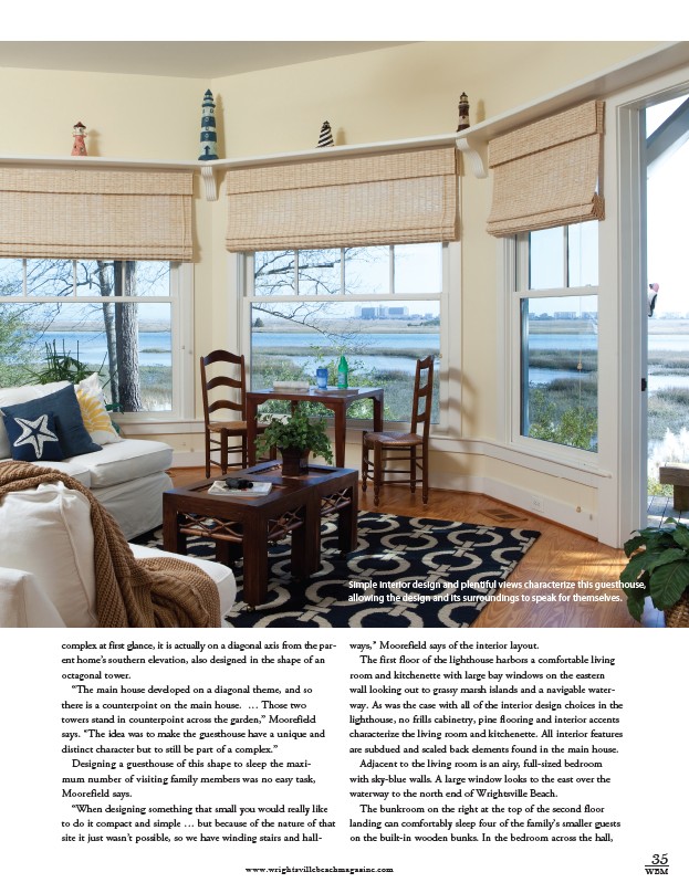
Simple interior design and plentiful views characterize this guesthouse,
allowing the design and its surroundings to speak for themselves.
Moorefield says of the interior layout.
The first floor of the lighthouse harbors a comfortable living
room and kitchenette with large bay windows on the eastern
wall looking out to grassy marsh islands and a navigable water-way.
As was the case with all of the interior design choices in the
lighthouse, no frills cabinetry, pine flooring and interior accents
characterize the living room and kitchenette. All interior features
are subdued and scaled back elements found in the main house.
Adjacent to the living room is an airy, full-sized bedroom
with sky-blue walls. A large window looks to the east over the
waterway to the north end of Wrightsville Beach.
The bunkroom on the right at the top of the second floor
landing can comfortably sleep four of the family’s smaller guests
on the built-in wooden bunks. In the bedroom across the hall,
www.wrightsvillebeachmagazine.com WBM