Rap, tap, tap goes the riff on the cymbal as the piano plays mezzo forte and the alto sax and trumpets file in with a response. The composition of compelling music can be transcendent. It can enable one to escape, to dream, and to perhaps surrender.
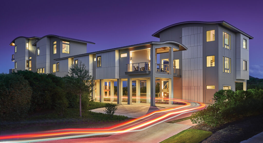
The same can be said about the composition of compelling architecture. At the offices of Kersting Architecture, founded by Michael Ross Kersting, a spectacular nighttime photo of the award-winning “Surrender” home is displayed on a flat screen in the conference room. The moonlit image captures Surrender’s illuminated frame.
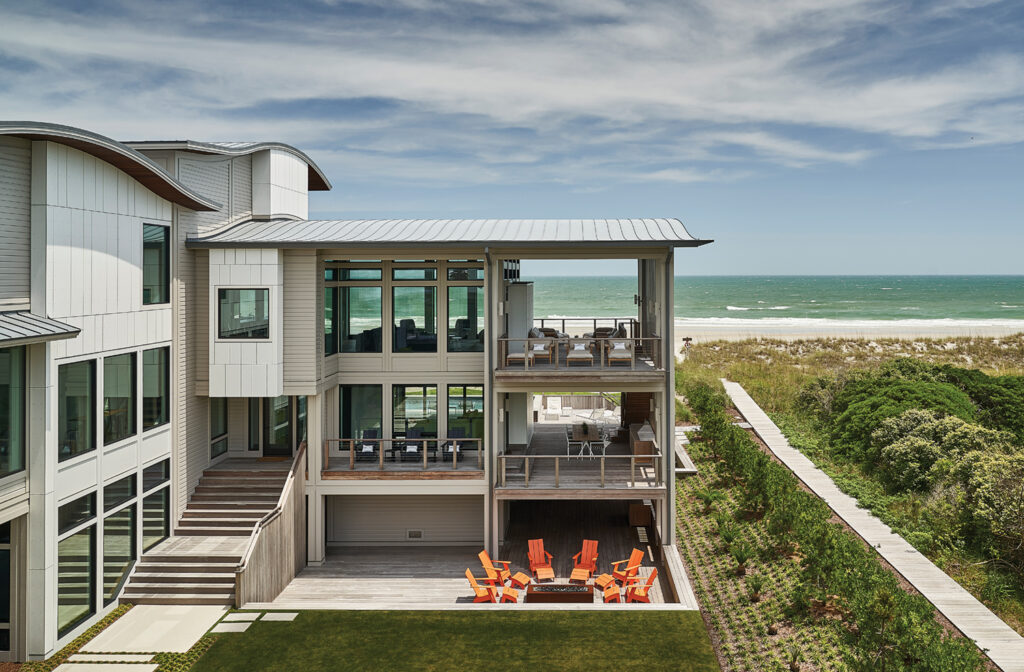
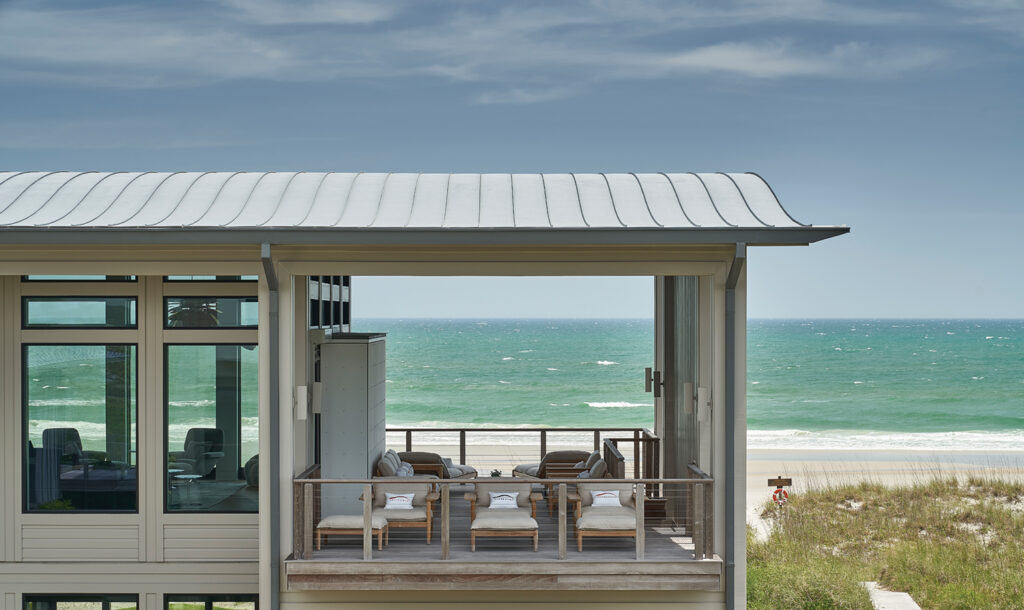
Surrender is an oceanfront dream home on the south end of Figure Eight Island. Its multi split-level layout features three wings in a C formation that surround a courtyard. All six bedrooms and living areas have views of the ocean. The back-wing bunk house achieves its panoramas through the living room encased in floor-to-ceiling windows.
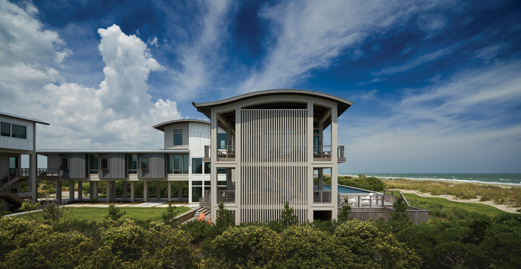
It is a truly compelling composition even by the standards of Kersting, who has been pushing the boundaries of architectural design for decades. Using materials never used before and creating a curvature in the rooflines never before seen in our area, the house achieves new heights.
“It’s kind of like jazz,” explains longtime Kersting architect and now partner Toby Keeton. He snaps his fingers like a metronome as he references the columns positioned 12 feet apart, a derivative of six feet on center. “There’s the back beat, there’s the rhythm… but then it all comes back to….”
“The bass line,” says Kersting, finishing Keeton’s thought.
“Exactly,” says Keeton. “It all comes back to this foundational structure that allows it to all sing together.”
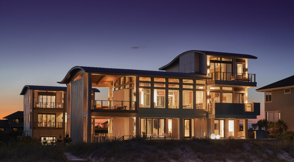
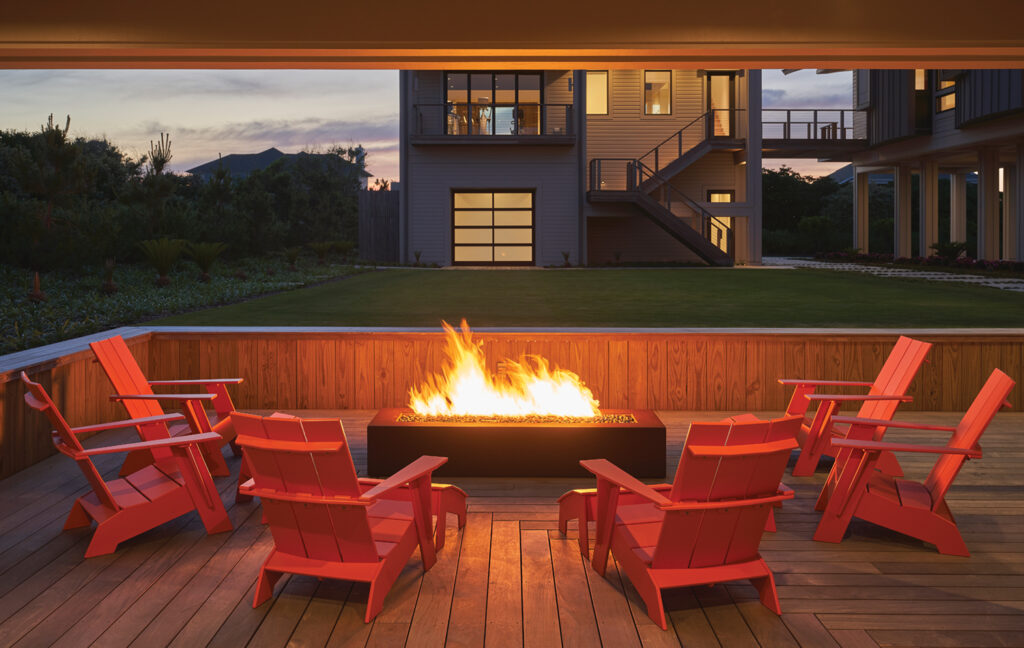
Winner of the George Matsumoto People’s Choice Award and the ASID Carolinas Excellence in Design Award, Surrender is a collaboration by Kersting and Keeton, Leslie Stachowicz of Kersting Peridot Interiors, and KingPost Design & Construction. The true visionary is the owner, Robin Kranich, head of human resources for a global research and advisory firm in Manhattan and mother of two. Kranich played an integral role in the design scheme and material selection. She dreamed up many of the concepts used in her Figure Eight vacation home and chose its name.
“I wanted a place where we will make happy generational family memories,” says Kranich, who is from North Carolina. “The one single place where my mind is able to turn off is at the beach. It’s a total sensory experience. The feel of the sand, the feel of the sun, the sound of the ocean is a place where I can just, surrender.”
The steel-framed home uses commercial grade materials such as Boral siding made of fly ash from coal plants and white through-color cement panels of Equitone to form a barrier against salt air, providing durability, low maintenance and style.
The curved zinc-covered rooflines were Kranich’s idea.
“It’s an architectural response to wave action, a reference to the ocean,” says Kersting.
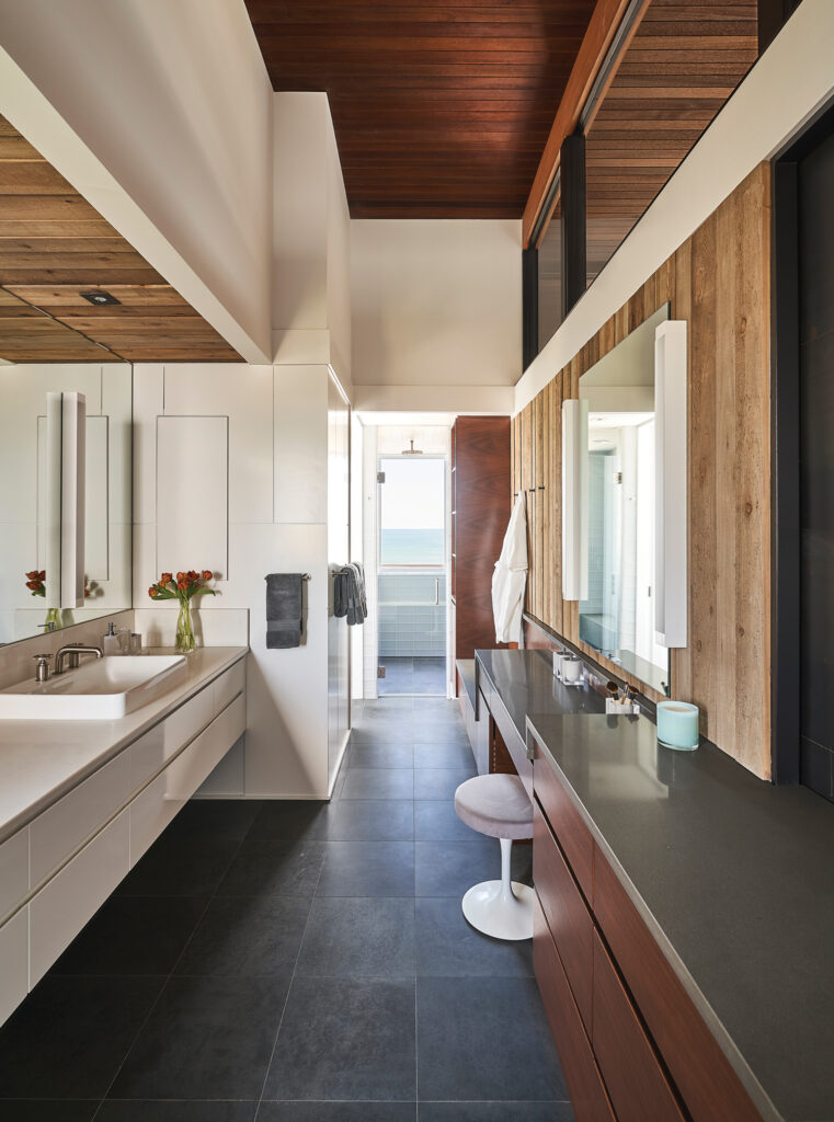
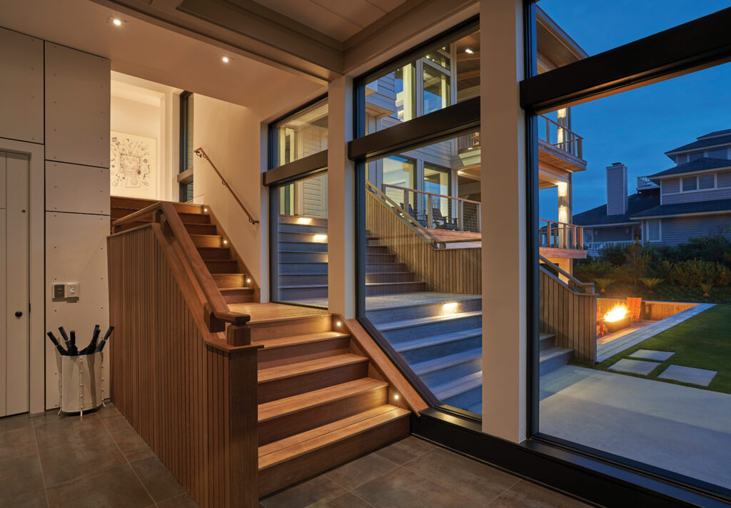
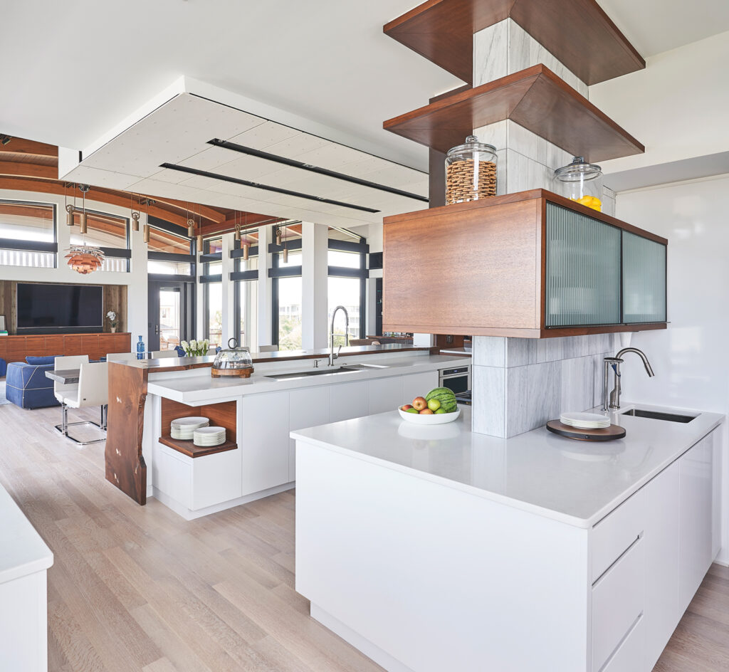
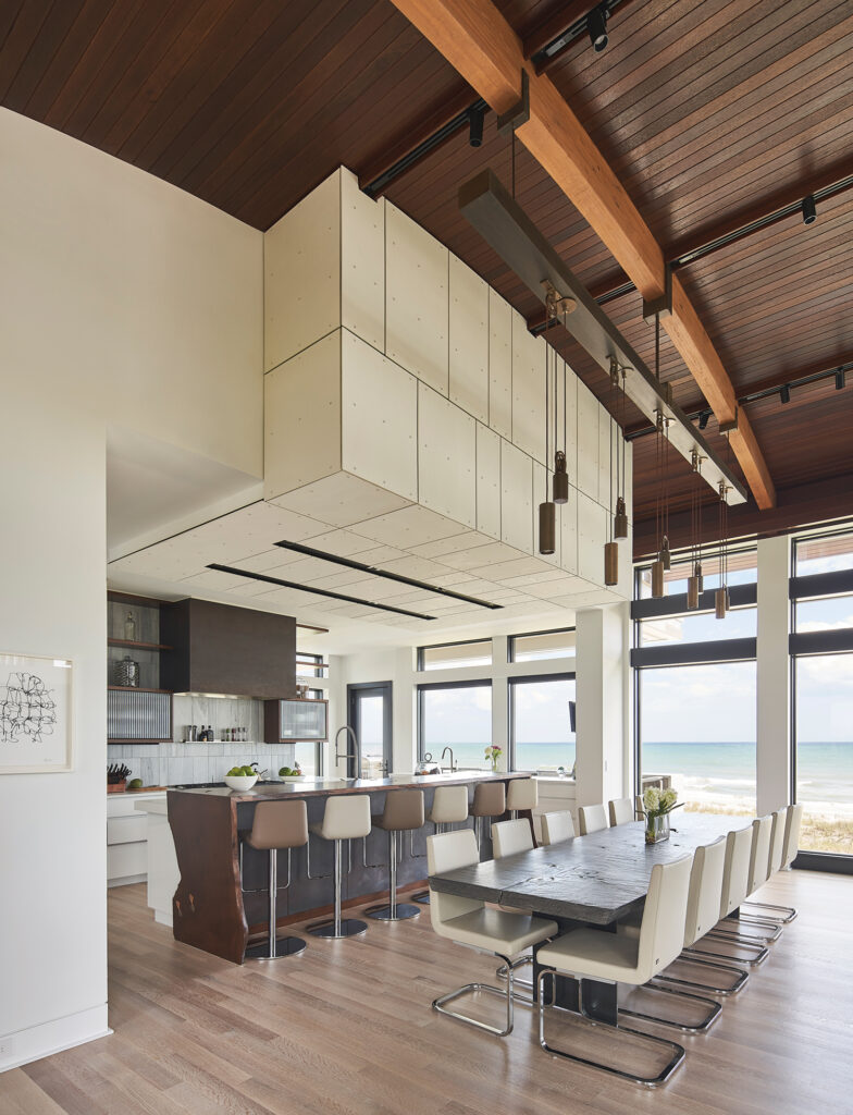
The Equitone panels are carried through to the interior design. The paneling is used on the walls of the stairwell and the kitchen ceiling. Ipe, oak, walnut, inland cedar and steel are the core materials selected by the Kersting team.
“We are trying to approach houses almost like a chef approaches putting a really good meal together. Instead of grabbing 30 ingredients, let’s grab five or six really key ingredients, look for different ways to use those key ingredients, and be consistent throughout,” says Kersting.
Ipe outside entry stairs are mimicked on the inside entry, seen through glass.
“Our ambition is to distort the difference of inside and out,” says Kersting.
Much of Surrender’s hardware is custom made at Kranich’s father’s company, which manufactures brass industrial valves. Name plates for the laundry room and guest rooms are made of Corten steel. Guest rooms are named after the street names of places where Kranich has lived.
Inverted pulls in a wave shape on cabinetry and textured bowties imbedded into counters are special touches representing Kranich’s family history.
“Robin’s father’s company gave us access to their foundries, so we got to design sand cast dyes to make our own brass hardware,” says Keeton.
Mise en place is a French culinary term meaning “everything has its place.” It’s the organization of the kitchen and ingredients that enables the chef to cook a fabulous meal with ease.
It’s the concept Kranich had in mind when constructing the perfect vacation home, where everything has a place and a purpose, and key ingredients are so well organized it becomes easy to relax and surrender.
“I wanted an elegant, intuitive experience where guests didn’t have to spend any mental energy. I wanted the lighting to be in the exact right place where you would expect a switch. I wanted there to be chargers at the places where you would be lying down and reading a book or being on your laptop,” says Kranich, who has a jar full of chargers on a shelf in the guest lounge for anyone who forgets theirs.
The home is broken up into four functional areas.
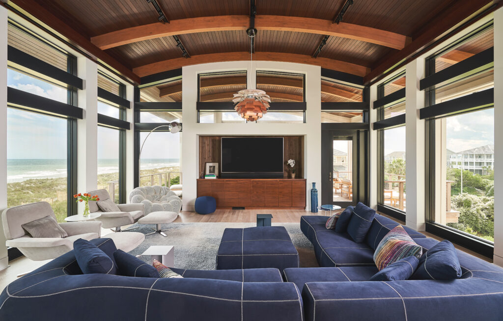
The main living wing is an up-in-the-sky space, essentially made of glass with its floor-to-ceiling windows. Stachowicz, the interior designer, worked with Kranich to select furnishings.
“Robin had a good feel for what she wanted in the house and since she lives in Manhattan, she has access to the really great modern furniture lines like B&B Italia, Roche Bobois, Minotti, and Knoll,” says Stachowicz.
Size and scaling of furniture were configured to the rooms. The living room’s Louis Poulson artichoke lamp is paired with a navy B&B Italia Bend sectional.
“We offset a mohair Joseph Carini cloud rug to anchor the space and worked with the furniture layout. We wanted soft fabric and soft lines for the upholstered furniture, comfortable and easy to take care of,” Stachowicz says.
Stachowicz mixes in vintage pieces found on First Dibs and Etsy.
The adjoining kitchen’s light fixtures are cast bronze. There’s a back prep-kitchen, a live-edge walnut island, and a 12-seat handcrafted dining table custom made in Germany of wood from a 17th century church.
“The top is char burned and limed oak. The base is custom designed for the chairs to fit equally spaced between the steel legs,” says Stachowicz.
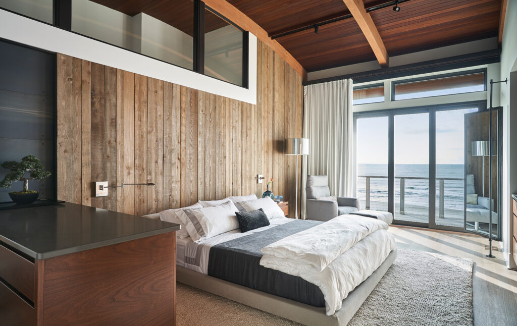
Above the living wing is the owner’s suite, a private retreat with a sliding door able to open up to the “away room” on the next level down. There’s a window in the shower for a lookout to the ocean.
“The owner’s bedroom is the most impressive,” says Keeton. “Leslie uses all the materials we already selected and creates a completely different feeling room.”
The hotel wing is a concept Kranich brought to the Kersting team inspired by travel overseas. Three side-by-side en suite guest rooms share an entertainment lounge that Kranich and the design team refer to as the haberdashery. One of the rooms is fashioned with an alcove for a crib for future grandchildren.
“I knew this would be a house to grow old with and so I wanted to have some really universal concepts. I was always thinking of each stage of life,” says Kranich.
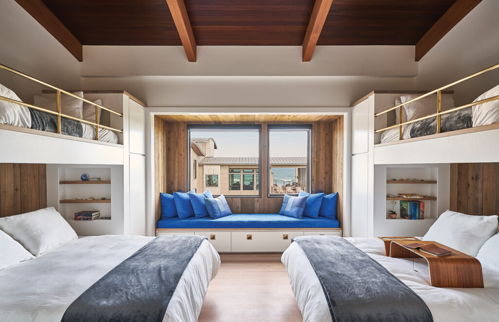
The bunk wing is for the kids with its own hangout area and a gym, able to comfortably sleep six.
“I wanted the kids to have their own place, so I built this bunk house concept. I knew whenever they got into high school and college they’re not going to want to be in little ‘Buffalo Bob’ bunk beds, so I coupled twin bunk beds on top with queen-sized berths below,” says Kranich.
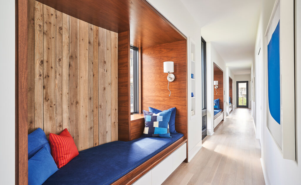
Interiors are interwoven with artwork that include works from musician Brian Eno and artists Ellsworth Kelly, John Baldessari, Sol LeWitt, Analia Saban and Damian Hirst.
“One of my favorite pieces she has is by Ann Hamilton and she has this incredible sculpture by Stephen Michael Beck called The Agenda. I love it!” says Stachowicz.
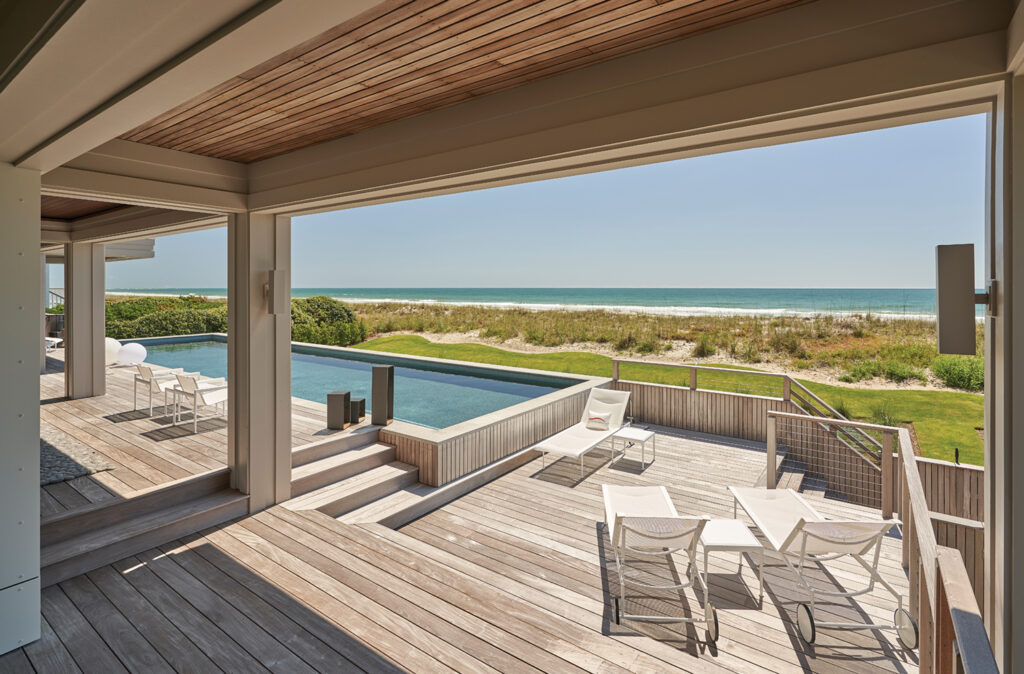
Outdoor living areas include porches and decks built for rain or shine. The oceanside pool deck has Richard Schultz for Knoll 1966 outdoor furniture.
“The house is oriented with that open porch to the southeast because that’s where the summer breezes are coming in from so it’s capturing those breezes. In the winter, it flips. There is a very cold wind coming from the northeast just whipping across the island so we use the house to block that,” says Keeton.
“If it’s raining, my absolute favorite place to be is under that porch looking out over the ocean,” says Kranich.
The creation of Surrender was the result of dynamic collaboration with a unique homeowner who challenged the team to explore new ground.
“It wasn’t about her bringing pictures in, it was about discovering and determining what was really needed and playing and trying things and arriving at some really good early ideas which became the foundation upon which every detail was built,” says Kersting.
“She spoke to us in concepts, the way she wanted the house to fit into her life and this idea of surrender, a place of refuge,” says Keeton.
