Kitchens That Cook: Pride of Place
Visionary owners maximize their spaces
BY Fritts Causby
Is it obvious to say the pandemic exerted a range of unforeseen societal impacts? In hindsight, the fact that many turned to home improvement projects as a way to cope or simply fill the hours does not seem all that irrational or unexpected. For many homeowners, the result of having so much downtime was that some of the issues and problems inside their homes suddenly became impossible to ignore.
The kitchen has always been the heart of the home, but with restaurants closing and very few dining options available in 2020, it became even more important.
Being forced into the kitchen to prepare a meal doesn’t have to be a bad thing, however. It can be something to be savored and enjoyed — especially when the cooking and eating take place in kitchens like those presented here.
Edging Toward Contemporary
Incorporating a functional design aesthetic was a goal for Chris and Susan Dixon, who purchased a home on Edgewater Lane that was built in 1978.
“We wanted an open floor plan with a large island at the center, so our family could be together,” notes Susan Dixon.
Opening the kitchen to showcase a view of the pool was also essential. Creating a contemporary atmosphere with clean lines and lots of hidden storage was another goal for the couple, who found their original design inspiration in a kitchen and bath magazine.
The couple shared that magazine photo with their contractor and his wife, David and Teresa Van Damme, as well as April Pearson, a friend who is an interior designer.
“We wanted something that would be contemporary without being too modern,” Dixon says. “Our house had been remodeled by several different owners, so there were many different styles to merge.”
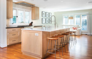
To successfully translate the vision, the design team replaced the tile with hardwood floors and mounted a sleek new range hood in the ceiling. A creative use of frosted glass for the doors allows sunlight to spill inside without sacrificing privacy, while white oak wood cabinetry delivers a seamless design aesthetic.
“We love everything about this kitchen, from the sliding cabinet doors that hide the coffee maker and toaster oven, to the drawer for the microwave in the island and the custom-made spice rack and utensil storage,” Dixon says.
Another innovative design feature is the drop zone by the entry, which was designed to conceal backpacks, shoes and coats.
“The large island with storage on both sides is another favorite for us,” adds Dixon, “because the quartzite looks like a frozen lake, and with the lights on at night, it really looks amazing.”
The slab of quartzite used for the island and the lighter tones in the wood cabinetry stand out against the darker stone that surrounds the gas range and beverage center. With glass insets in the cabinet doors that make it easy to find the perfect coffee mug, rocks, tumbler or wine glass, plus an integrated wine fridge, beverage centers such as the one in the Dixon’s kitchen have become an increasingly popular design feature.
Custom Built Meets DIY
When Damon and Georgia Savas left their 2,800-square-foot, three-story house in North Topsail Beach in favor of building a 1,450-square-foot, Craftsman-style cottage in downtown Wilmington, squeezing everything into a smaller space was a challenge.
“One thing we knew we needed was a large, functioning kitchen,” Georgia Savas says. “I am a decent cook but Damon has worked in restaurants off and on throughout his life, so he spends a lot of time prepping, dicing, baking and roasting.”
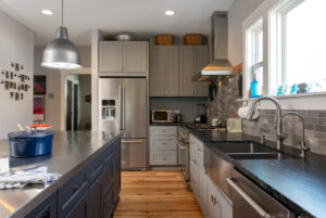
The couple opted for an expansive stainless-steel island to serve as a centerpiece, emphasizing its durability. Built by local craftsman Billy Vaughn of Wilmington Sheet Metal, it has space for three bar stools and measures almost 9 feet long.
“This is the third stainless island we’ve had, because it’s the best functional prep material around. Unlike other surfaces, it actually looks better the more you use it,” Savas says.
To balance the sleek industrial aesthetic of the center island, leathered granite counters, light fixtures, and gray and dark metallic cabinetry, the couple brought in wood hutches from Home Again, a local store in Landfall, along with hickory for the trim above the backsplash and flooring.
“The wood hutches break up the monotony of the grays beautifully,” Savas says.
The couple wanted hickory planks for the flooring, but was told anything wider than 5 ½ inches would be impossible unless engineered wood was incorporated into the design, as the moisture content in the air would cause them to buckle and/or cup.
The Savases eventually found Jon McDow of Coastal Live Edge, who explained that many wider planks buckle and cup because the trees are not locally sourced or dried in a local kiln. McDow said it is possible to go as wide as the tree for the planks, if the sourcing, processing and drying is done locally.
“If you’ve never seen Jon’s work you are missing out,” Savas says. “This young guy felled the hickory trees in Hampstead, dried the wood in his homemade kiln and milled them himself — installing them in the old top-nailed fashion.”
As with many other things in life, having to spend a lot of time and effort made the process and the experience more meaningful.
An ordering mix-up from the contractor resulted in the wrong color choice for some of the cabinets, so Georgia brought home a store sample for experimentation. She spent a few days rubbing paint and adding metallic, then finally using a metal file to rub off the edges. After the contractor told her he could not trust his crew to produce the same effect, she ended up filing and sanding 33 cabinet fronts.
She also had a hand in creating the fixtures that illuminate the center island.
“These are just industrial high bay reflectors I found at Grainger, but they were too shiny, so I spray painted them and added some basic pendant inserts,” she says. “The light over the dining table was a basket we also converted to a pendant lamp.”
With many hours spent in the design as well as bringing the finished product to perfection, the kitchen was a labor of love.
“We really use our kitchen,” Savas says. “Function definitely comes before form, but I can’t let form suffer. We both come from Greek families where real food is paramount, and we basically cook every meal at home.”
Elevating the Farmhouse
Having a comfortable gathering space with room to host their three young children and large extended family was a top-level item of importance for Molly and Brad Tilyou when developing a vision for their new kitchen in the Windward Oaks neighborhood.
“Our kitchen was designed around our lifestyle, as well as the need to accommodate a crowd and entertain,” Molly Tilyou says. “Function played just as big of a part in the design as the fashionable choices of materials and finishes.”
Three large windows placed over the farmhouse-style sink bring natural light indoors and provide a view of the outdoor living areas, which include a covered porch and deck, play house, and pool. Shiplap trim work and a fun splash of blue distinguish the center island, an essential design feature for the couple.
“As a large family who loves to entertain, our lives revolve around the kitchen island,” Tilyou says.
To create a point of interest and a backdrop for the hustle and bustle, a dynamic feature wall was placed over the cooktop, incorporating a picket fence tile backsplash, a custom-made vent hood from Port City Cabinets, and floating shelves from Austin Trotman of Trotty’s Custom Carpentry.
In their search for a design that would successfully integrate their favorite elements from the contemporary farmhouse aesthetic, the Tilyous collaborated with Maggie Pinson of The Magnolia Project.
“Maggie helped us dial in the details in every room, from the kitchen design to the wall colors, flooring types and styles — you name it, she helped us find the right items to go with our individual preferences,” Tilyou adds.
Online purchases include lighting and cabinetry hardware. Jute pendant light fixtures illuminate the central island, and sconces in an antique brass finish highlight the feature wall. Satin gold drawer and cabinet pulls pop against the chalk white cabinets, adding a touch of elegance and style.
One of the more surprising finds that Tilyou and Pinson uncovered occurred locally in their search for the kitchen sink, found on the sales rack at Lowe’s Home Improvement.
“We added a single panel swinging pantry door that feels traditionally farmhouse, but sleek enough to go with our cabinetry,” Tilyou says.
The design focus, materials, amenities and color scheme were also influenced by the fact that both Molly Tilyou and Brad Tilyou work in real estate: Molly is a Realtor, Brad is a licensed general contractor and area superintendent for Mungo Homes.
“Our inspiration came from contemporary farmhouse design, but we always like to add a touch of ‘Tilyou,’ creating playful features that set our home apart and make us feel excited to enjoy our home daily,” Tilyou says.
As an aspect of this approach, they added a charging station in the appliance elevation as a place to drop off phones, tablets and computers when returning from work.
“Planning for lifestyle-related features like that were the most fun in designing our home and kitchen,” Tilyou adds.
Classic Meets Trendy
With fresh white cabinetry and volume ceilings accented by custom wood paneling, the vibe in this airy kitchen that was custom-designed and built in Landfall by Linda Haller and her husband, Tom Haller, is inviting and cheerful.
As a new build, the space provided the retired interior designer with a blank canvas to showcase her unique design vision, taste and preferences.
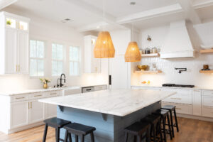
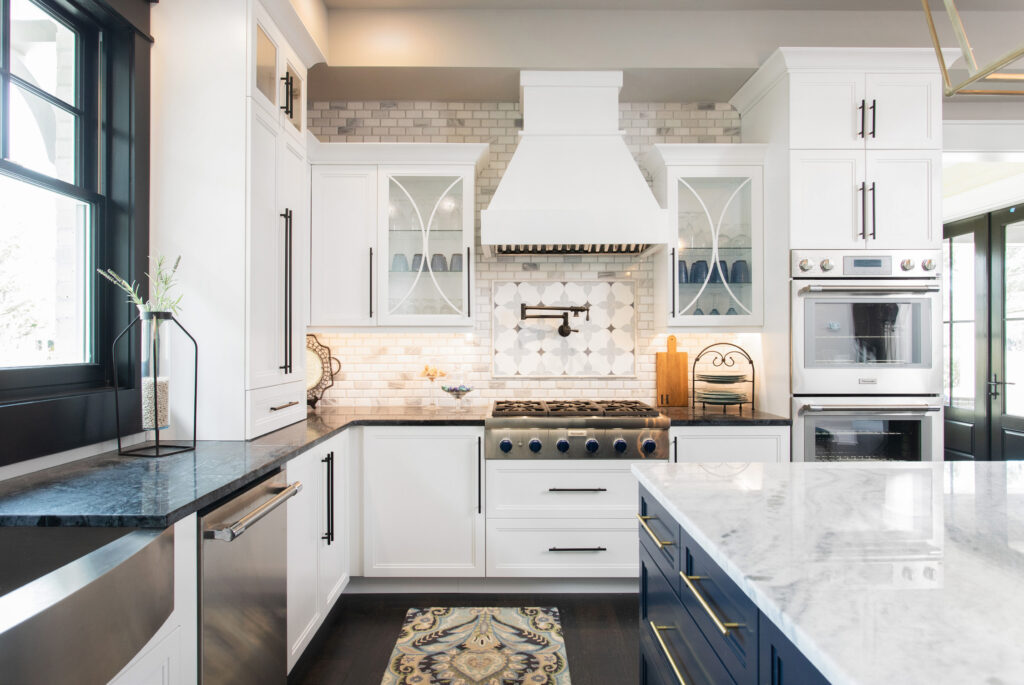
“I love to design my homes with mainly classic choices, but add fun pops of trendier things,” Haller says. “Huge lanterns are really in now, so I put two mixed metal beauties over my island.”
She also selected oversized cabinet pulls and black window casings to keep the timeless aesthetic of her kitchen up to date. Along with the wide plank hardwood floors and the deep navy hues that infuse a touch of color into the center island, the black window surrounds create an elegant contrast with the bespoke white cabinetry and stainless appliances.
“My favorite designs are timeless, classically styled rooms,” explains Haller. “So, I chose a piece of beautiful marble for my island countertop, and soapstone for the other countertops.”
As an aspect of her focus on creating a timeless, clean space free of distractions and unnecessary clutter, Haller went to great lengths to hide outlets and conceal small appliances. “It was very important to me to have a pull-up mixer stand, no visible outlets and a built-in coffee system,” she says.
Having big drawers with peg systems and high-end appliances were other important features for Haller, who says the tile backsplash over the rangetop is one of her favorite elements of the design.
It was also important that the design provides a high level of functionality as well as a gathering space for friends and family.
“I selected a u-shaped design with a big square island because I have found that to be the best for everyday living as well as when I’m entertaining,” she adds.
