Timeless Waterfront
A classic design brings family together on Lees Cut
BY Amanda Lisk
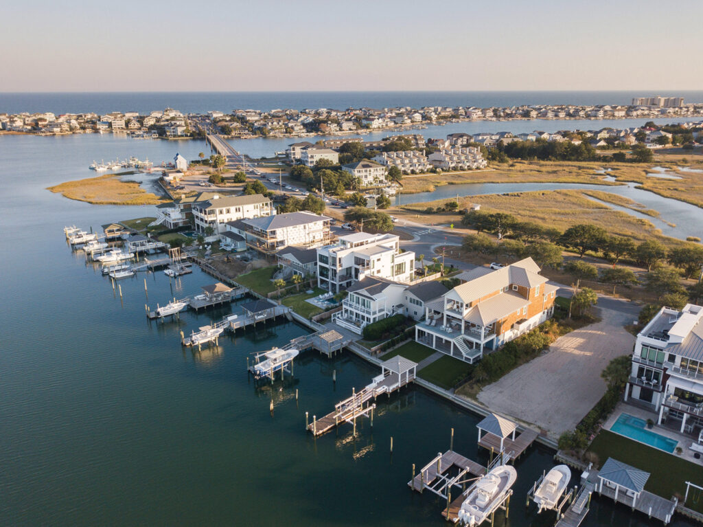
When approaching what began as a teardown on Pelican Drive at Wrightsville Beach, the goal for what would be built in its place was simple and could be summed up into one word; family. With children, grandchildren and grand-dogs, the new home needed to be durable yet pretty, current yet classic, and most importantly, functional for three generations of family to enjoy. Warm woods, mitered counters and touches of European influence seen in handmade tiles and arched doorways come together in a thoughtful, timeless design overlooking Lees Cut on Harbor Island.
With panoramas of the channel and marsh views from all angles, the lot was a gem. Its new owners met with the builder, Tanner and Ralph Konrady of Konrady and Son Construction, on site. The plan was for the 1,200-square-foot house that occupied the property to be torn down and replaced with new construction, a vacation home for a family of three generations.
“The goals of the home were function, family, enjoying the beauty the lot provides and being able to take in all those views and low maintenance on the exterior was also very important,” says Tanner Konrady.
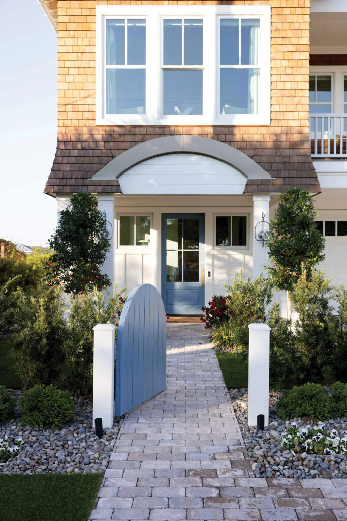
The exterior façade boasts a sturdy combination of PVC trim, red cedar shingles siding, a metal roof and impact windows and doors. The architectural design by Pinkston Drafting Company ties in classic Wrightsville Beach with Cape Cod style elements.
“This particular client was well-versed in the homebuilding process, they had built homes together so they were very decisive which allowed us to maintain a good schedule and make quick decisions,” says Konrady.
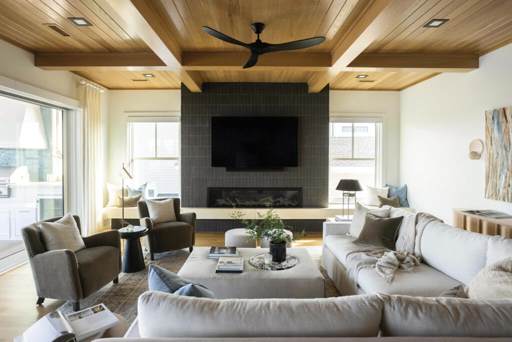
The Japanese term shou sugi ban means charred cedar board, a material the homeowners saw while living in Japan. It inspired the use of a dark cement tile on the fireplace in a soldier stack layout.
“That burnt black wood, that was our original inspiration to have a dark focal point. We wanted to maintain that handmade element so we found a handmade, very textural brick,” says Kasey Smith of Kasey Smith Interiors, who worked with the homeowners on the interior design.


“By doing it in a vertical stack, it makes the room feel and look much bigger and then we mitered all the returns,” says Tucker Beerman of Refine Tile and Sellers Custom Counters.
The fireplace bench is by Mann’s Concrete Collective.
White oak ceilings throughout have clean, modern recessed lighting in matte black.
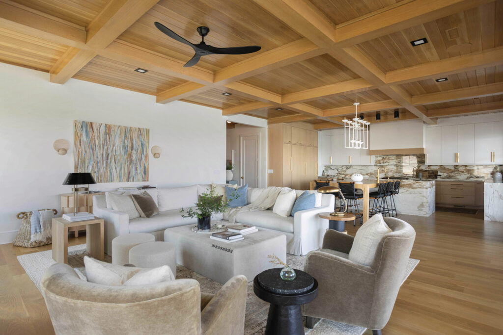
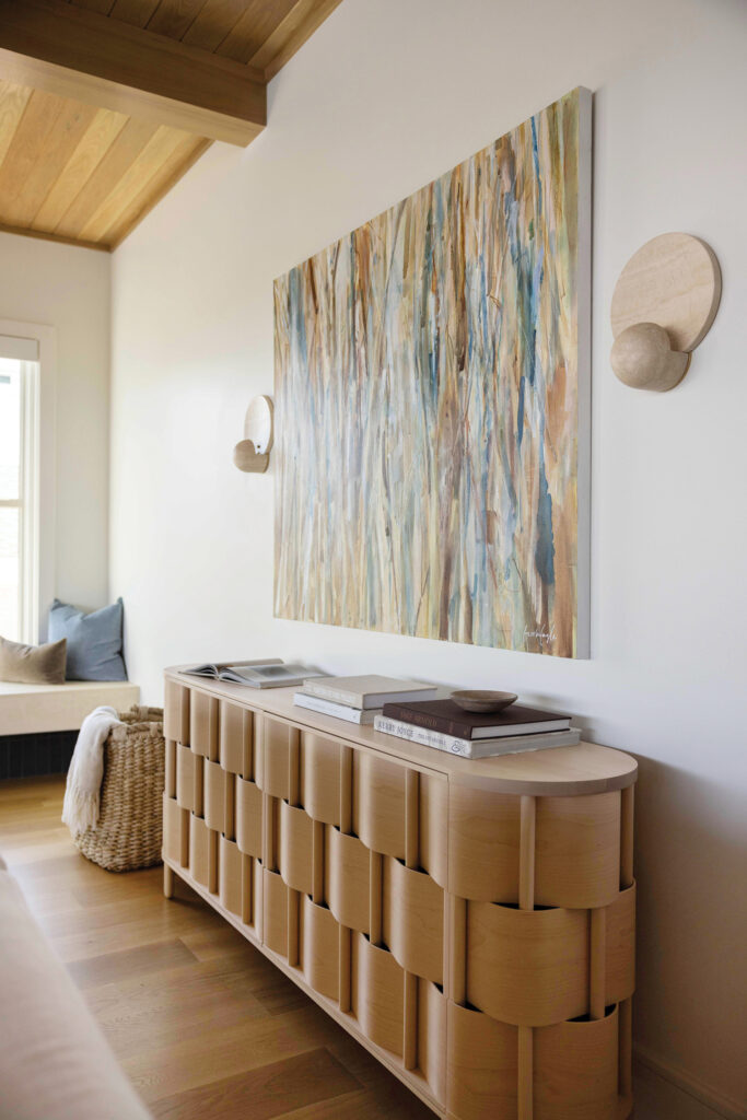
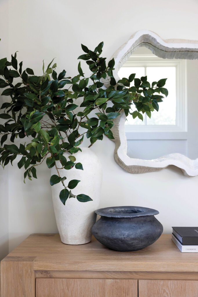
Wall art is by local artist Brooke Eagle. Sconces are by Carlyle Collective.
“They are sculpted from travertine stone and provide a warm glow and personality to the space,” says Smith.
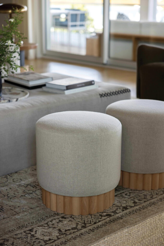
A vintage Oushak rug is layered with a jute rug underneath for texture.
“We fell in love with its subtle blues and warm tones, it has a distressed feel,” says Smith.
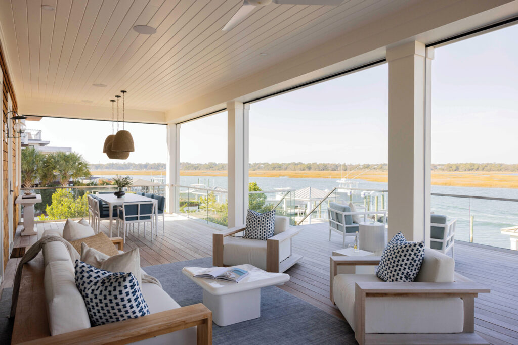
The family room’s 22-foot-wide slider opens to the back porch and outdoor kitchen.

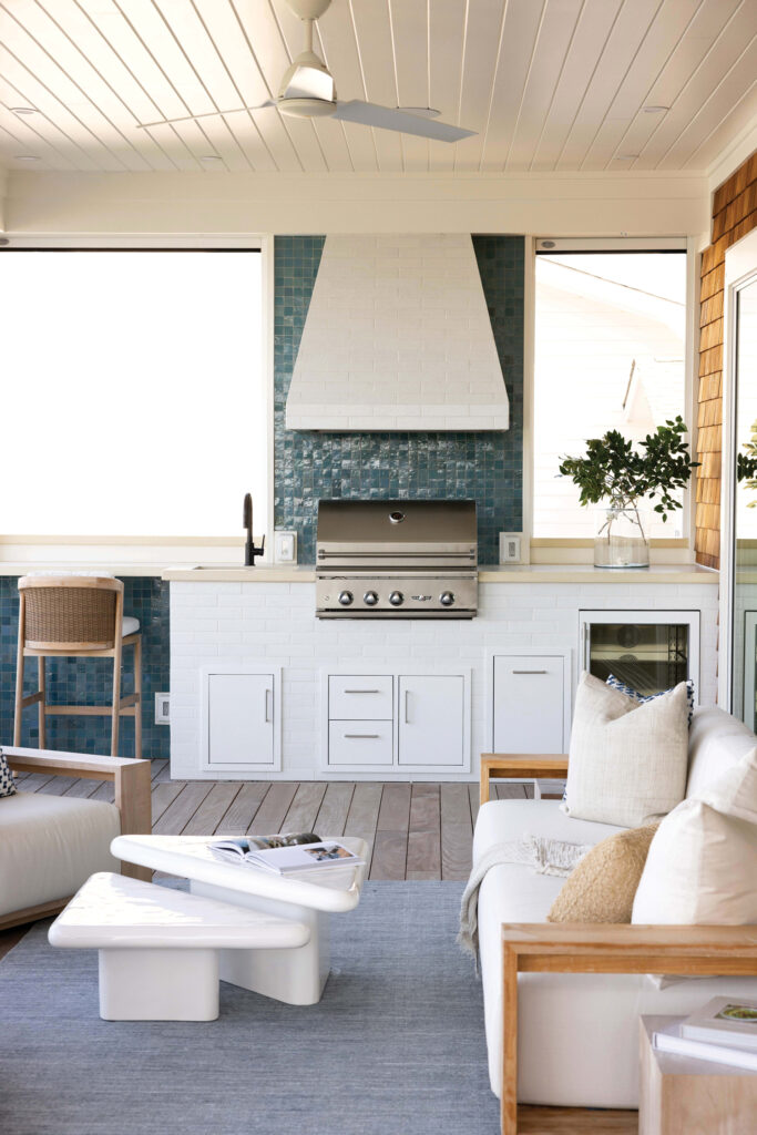
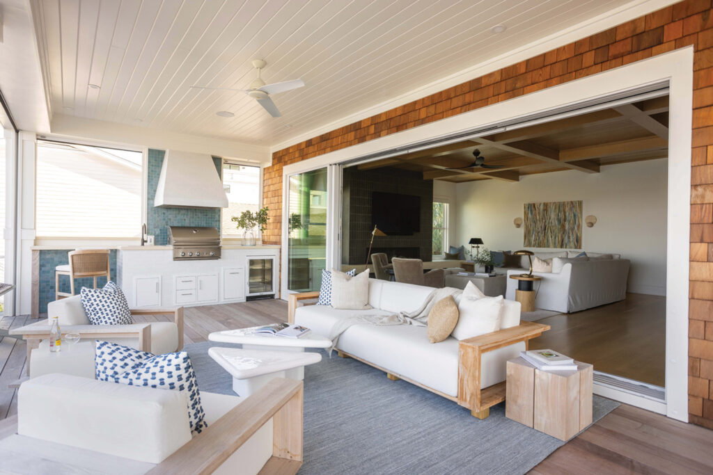
Hues of blue from the waters of Lees Cut are matched with a zellige tile surround at the outdoor kitchen grill cooktop.
Also tiled is the outdoor grill hood and cabinet faces, providing durability and dimension.
The homeowners hand-drew the outdoor space they envisioned including the clever counter extension for additional seating. Konrady built in a screened porch option.
“Screened porches are something people ask us about all the time. The roll down screens that were incorporated into the trim and post wrap so that when they are deployed you have a screened-in porch and when they are rolled up, they are hidden, you don’t see them,” says Konrady.
Outdoor furnishings are purposely low profile so they don’t obstruct views.
Looking out to the boat dock and surrounding views, memories will certainly be made at this beach home.
“I just see so much fun being had all summer long with their family,” says Konrady.
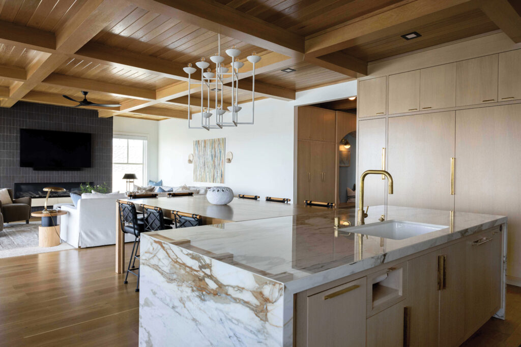
Warmth, charm and that island. The kitchen clearly steals the show as seamless porcelain runs full wall and mitered waterfall edges wrap around white oak cabinetry.
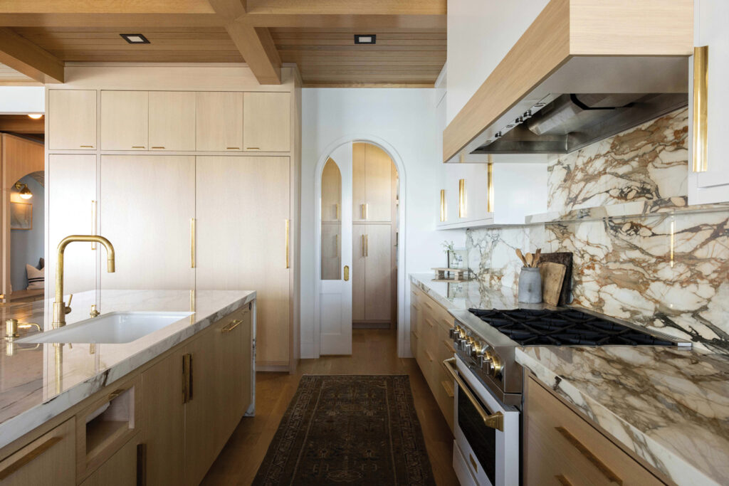

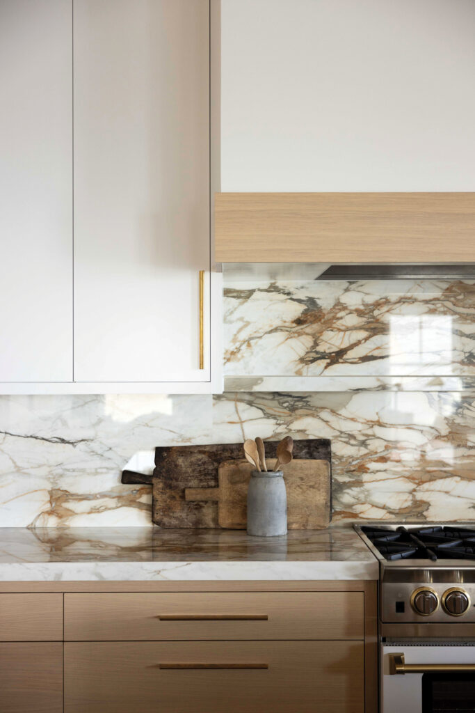
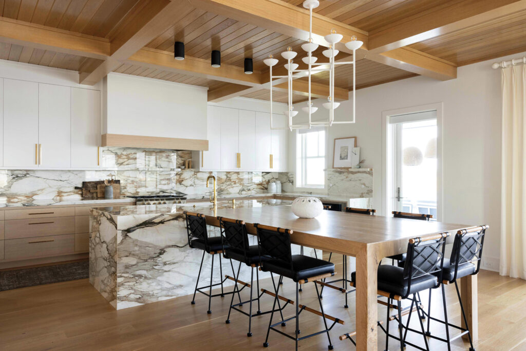
“The big decision was the countertops that were really going to make a statement. The homeowners loved the look of a bold marble. We found a more durable alternative with the porcelain,” says Smith.
The home’s tile and counters are by Refine Tile and Sellers Custom Counters. Beerman explains mitered edges give a more clean, bulkier aesthetic.
“Porcelain slabs are starting to become a pretty big design element in newer homes. We’re seeing this become more and more prevalent,” says Beerman.
A floating shelf of porcelain is purposed above the range.
“From afar it looks like one piece, but when you get closer there’s a shelf built into the full height splash. That’s become popular as well. We take the counter and run it vertical instead of doing a tile backsplash,” Beerman says.
An arched pocket door leads to the pantry. White and white oak cabinetry and panel ready appliances are by Hollingsworth Cabinetry, which incorporated a special drawer just for the paper towel roll.
“The paper towels are not sitting out on the counter all the time,” says Smith.
The placement of the kitchen dining table brings family together. The custom oak table extending out from the island was hand-crafted by Konrady carpenters.


“The homeowners are very family centered. They kept bringing up Thanksgiving and having the whole family there, the house was going to be full during the holidays. They wanted the space to feel inviting,” Smith says.
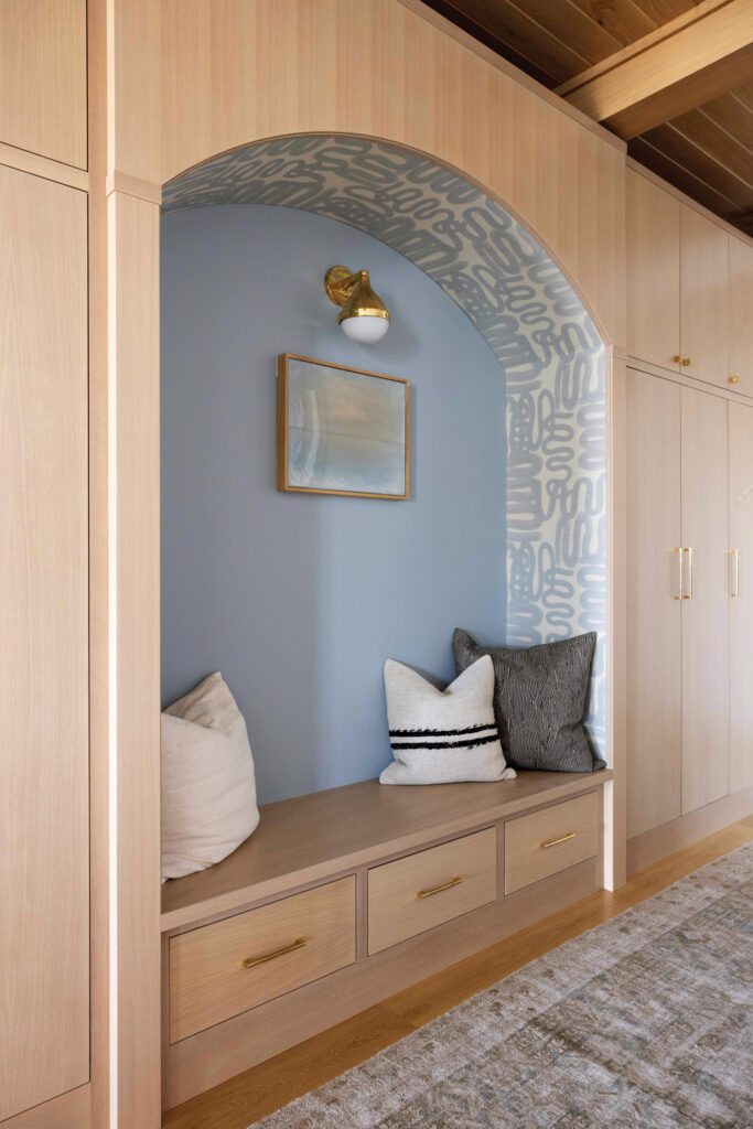
Touches of European influence such as unlacquered brass hardware that will patina over time and the arched pantry door bring old-world charm into a new build.
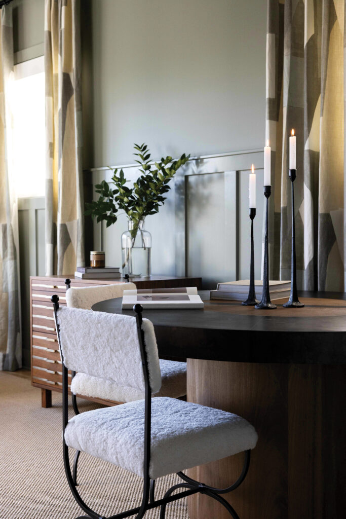
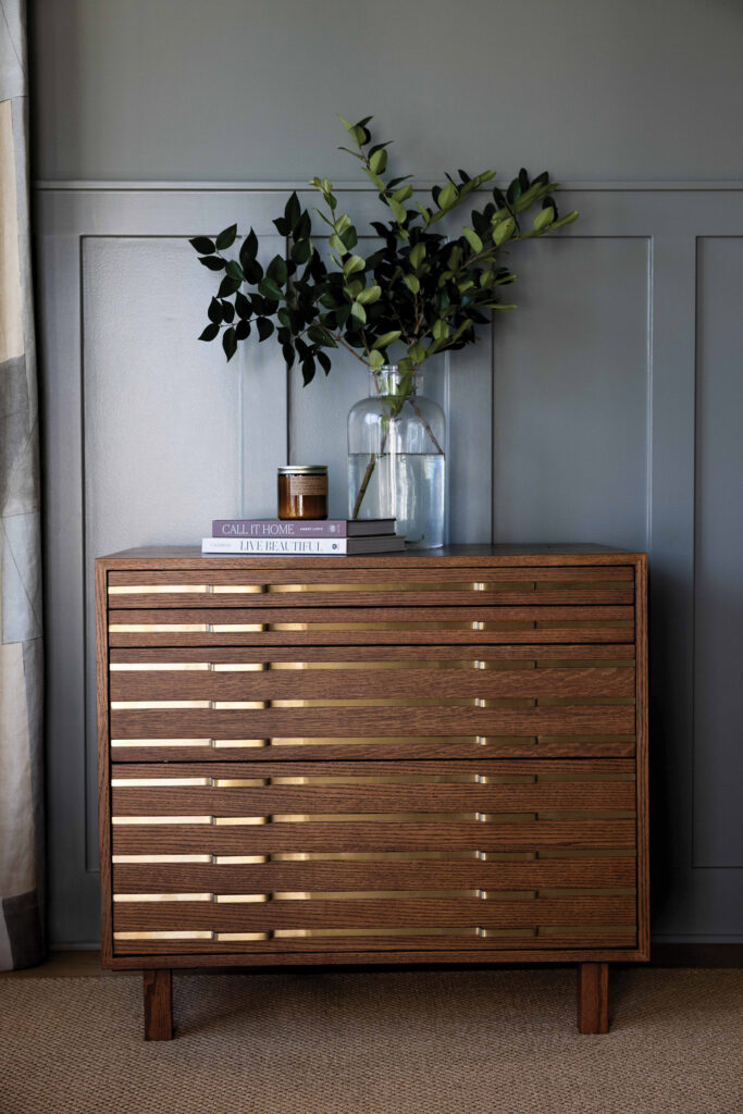
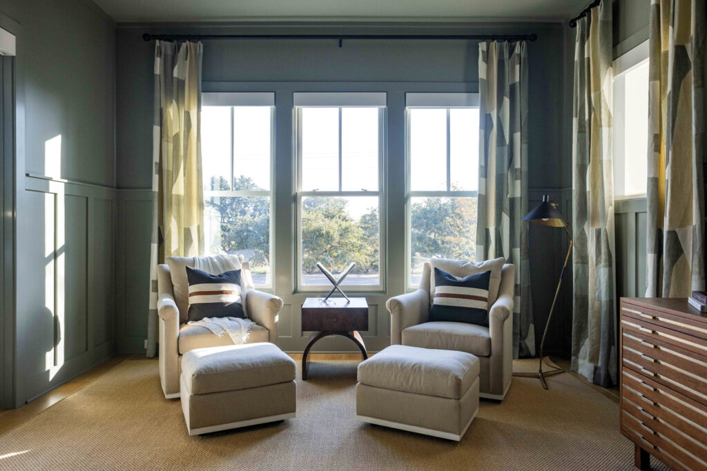
The home office/study is color drenched in Hunter’s Point by Sherwin Williams, inspired by a tone found in the hand-painted print of the linen drapery by Kelly Wearstler.
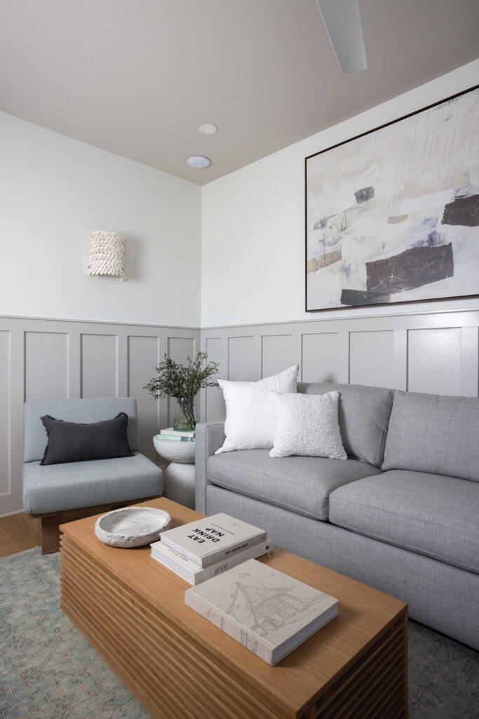
“If you do a space that’s moody, you want to have some elements that tie in the rest of the house, so you can see the iron elements in the chairs, they are by the same designer as the counter stools in the kitchen,” says Smith.
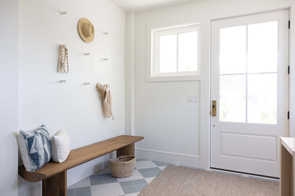
A combination of art with function is displayed in the foyer’s peg wall for beach items and a crocheted dog leash. There is an additional drop-off zone at the top of the stairs with a built-in bench seat with storage drawers.
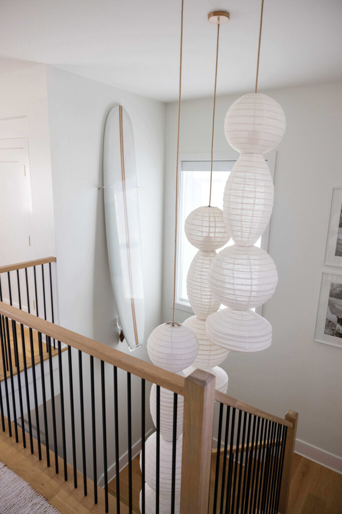
A custom surfboard by Smith Surfboards hangs in the stairwell. The homeowners worked with the architect to design an open staircase.

“Having the stairs open floor to ceiling provides a really cool feature and makes the home feel much more open. For everyone to be able to see and talk to each other is a little more inviting,” says Konrady.
Square tiles in a diamond checkerboard layout in the foyer continue into the elevator.
“Once that elevator opens to the foyer, we wanted a seamless look. The installers did an awesome job of repeating that pattern,” says Beerman.
The upsized laundry room feels squeaky clean with pale blue cabinetry and a zellige, distressed floor tile.
Wave-like swirls in the massive slab of marble and sand-toned textured floor tile gives the look and feel of being at the beach in the primary bathroom.
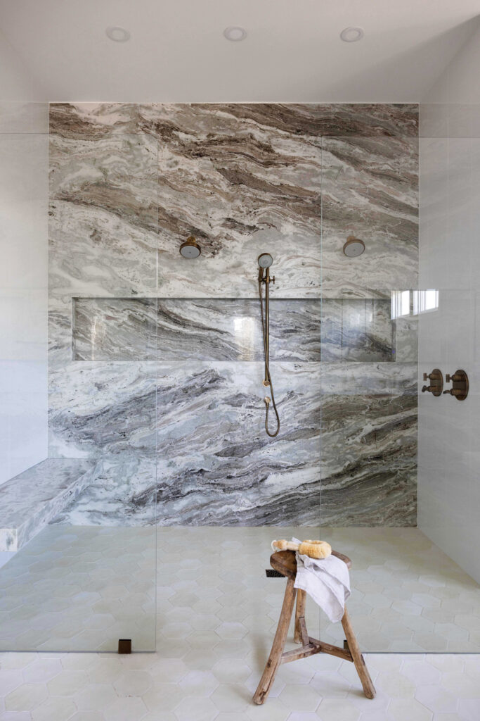
“That is ‘Fantasy Brown’ marble, we built in that box into the slab again using miters and did a floating bench using metal brackets,” Beerman says.
Bedroom furnishings and décor are kept simple and cohesive with bedding narrowed to one oversized lumbar pillow for minimalism.
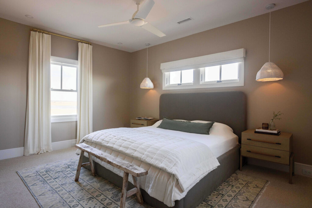
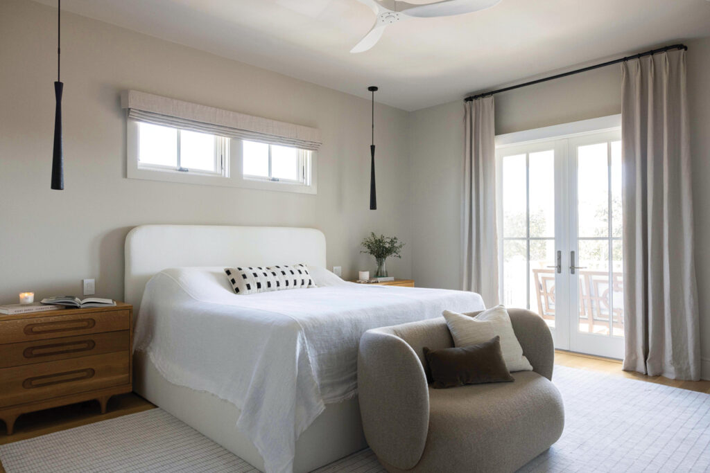
“We wanted to avoid the inevitable stack of throw pillows at the foot of the bed,” Smith says.
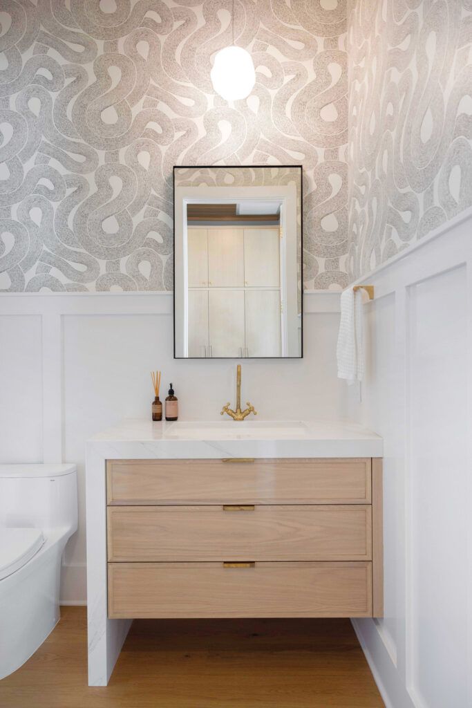
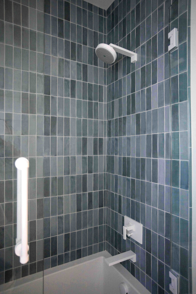
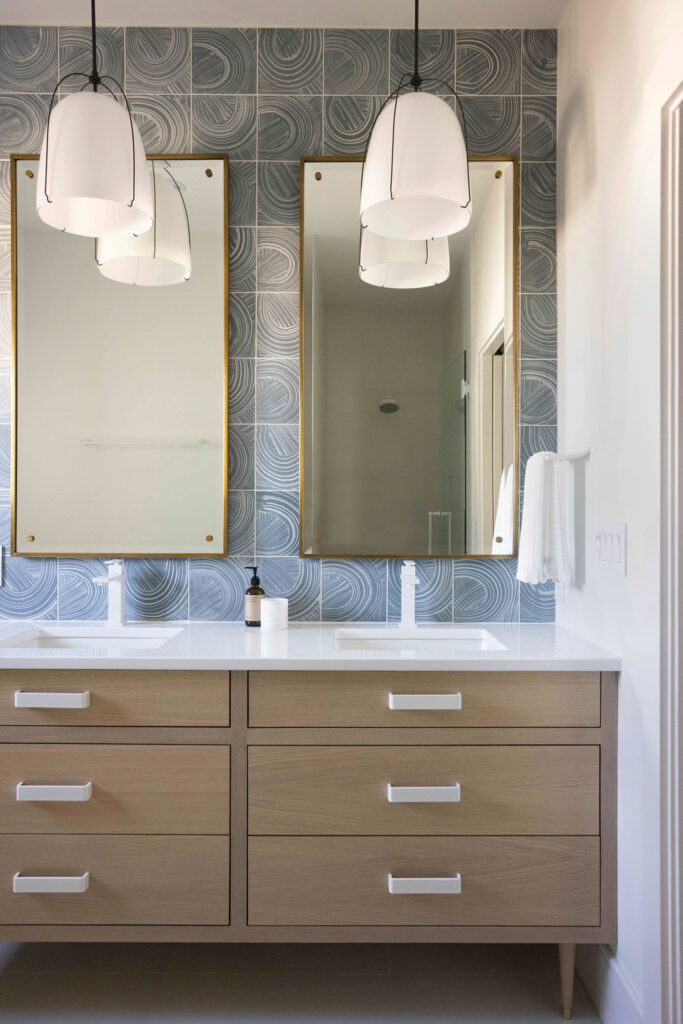
Bathrooms share cohesion as well yet are uniquely different with multi-toned zellige and handmade patterned cement tile being used. Matte white hardware and fixtures complement floating cabinetry topped with varying thicknesses of counters and edges.


So proud of my brother Ralph, nephew Tanner and niece Kelsey for their success and all the fabulous projects they have they have done on the beach and surrounding communities! They have put together an awesome group of employees, subcontractors, material suppliers, interior designers/architects and support staff who continue to redefine the true meeting of custom residential home Building.
Being retired from the business myself, I truly appreciate all the hard work, effort, and attention to details that it takes to satisfy the most discriminate homeowners.
I remember my nephew telling me several years ago when I told Tanner you and your are really taking “Konrady and Sons to a new level” He remarked “I’m Building A Brand” uncle Ron!
Congratulations guys keep up the good work!
Ron Konrady