The Pinnacle of River Place
Local visionaries transform a blank canvas into a penthouse design showcase
BY Fritts Causby

At first glance, it may be hard to tell if this is a custom-designed art gallery overlooking the Cape Fear River, a showcase for an interior designer and local architect, or a chic urban penthouse filled with modern finishes and fixtures.
The simple answer is all three, but in a residence that blurs the line between these classifications.
Resting at the apex of River Place, a new building on Wilmington’s riverfront, the property represents the culmination of a three-year process between Rob Romero of Romero Architecture, Danielle Saintard Valiente, owner and lead designer of Port City Design Group, and numerous local artists, artisans and craftsmen.
“My design intent was to create something unexpected in a predictable shell,” Romero says. “I introduced curves to soften the hard edges, to let the body and eye flow with the flooring, ceiling and furnishings.”
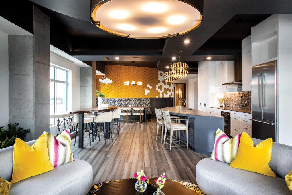
With interior architecture that transforms rectangular spaces into curves, the space blends yin and yang elements. These contour to the ceiling and reflect back to the floor, creating a meandering circulation path through a bookmatched semicircular kitchen island and entertaining table, toward sofas facing each other and the USS North Carolina outside the windows.
“Every window has a spectacular view,” says the owner. “The views are abundant…the Cape Fear bridge, the Riverwalk, a fishing boat or barge traveling the water, church steeples, rooftops of buildings…but the most rewarding view is the sunset. Mindfulness living comes easy here.”
“The owners were looking for a great second home location, something that would be accessible to fun things to do but also provide a venue to house and display bold pieces of art,” Saintard Valiente says. “With that in mind, we created a monochrome shell, a museum-style backdrop for the many art and accent pieces located there.”
Carrying curves through the foyer, the dark ceiling soffits are mimicked through the floor tile that bends and bleeds into the kitchen island. The high sense of contrast provided by the light walls and dark ceilings offer opportunities for art to stand out, gallery-style.
Sunrises and sunsets wax and wane over the living area windows, matching the goldenrod, magenta and chartreuse accents inside. Pillows pop against facing arced sofas.
“We used freeform shapes to create circulation and define the various living spaces, with an emphasis on avoiding linear forms,” Saintard Valiente explains.
In the monochromatic den shades of gray blend among multi-faceted textures. The ceiling is composed of suspended cork tiling, unifying the design elements and absorbing the sound off the cold, hard textures.
Conversely, the tweed and wool fabrics, layered custom pillows, and his and hers chairs offer hospitable comfort and warmth inside a colder shell. Ottomans with black, white and chartreuse spirals line the perimeter.
In most of the living areas, including the open concept kitchen/dining area, distinctive, heavy textured mixed metal light fixtures hang over bamboo floors.
“The colors are the base to let the art and specialties come to the forefront,” Romero adds. “The materials are seamless. Each space is a gem.”
Exposed concrete beams divide the living space, separating the entertaining table for cocktail hour and the banquette for casual dining.
In the powder room, a unique, welcoming element was executed by local graffiti artist Nathan Verwey, who created a spray paint and acrylic ode to Andrew Wyeth’s seminal masterpiece, Christina’s World, where the abstracted view over downtown allows the subject to reflect on her life and future.
“The idea was to have a woman facing away from the viewer, finding solace and allowing her thoughts from the day to slowly unravel,” Verwey says. “I was always intrigued by the power of the original subject, which is why she has a crown. This is about the power of the individual to find strength in oneself.”
The focus on renewable materials continues with the bedroom floors, where Marmoleum was selected for its seamless appearance, durability, and because it is created from non-toxic, natural renewable materials.
A wire mesh sculpture of a man and a dog occupy a corner of the guest suite, where abstract art and a retro patterned headboard highlight the inside of the curved banquette wall.
In the master bedroom a floating walnut bed adds a touch of warmth and reflects the emphasis on natural materials. Nightstands float below striped wood upholstered panels, which replicate in the diagonal lines in the area rug below. Hanging pendants reflect patterns of light and shadow against the fabric backdrop.
Clean lines and a floating vanity in the master bath are warmed with ambrosia wood drawers, an upholstered bench, chunky textured mirror frame, and glowing light from sculptural sconces.
“I love creating very special and unique spaces for my clients,” Saintard Valiente says. “That means that, in one house, I don’t want any of the rooms to be the same, I want to create separate, unique custom spaces that deliver that wow factor for each client.”
“The uniqueness of Rob’s architectural design vision plus Danielle’s talent for ‘out of the ordinary’ design concepts were the perfect collaboration for our penthouse project,” the owner says. “Many additional, dedicated and talented people played a huge part in this project who worked tirelessly to create what it is now…beautiful home sweet home!”

A most colorfully desighed condo interior.
The flush cook top, separate semicircular work counter and simple but elegant cabinet doors lend an air of elegance to the dining area.
I am sure the new tenants will enjoy the Water Street view of the busy Cape Fear River as much as we do.
Our best to all.