Reinventing a Coastal Triangle
An architectural home showcases an innovative design approach
BY Fritts Causby
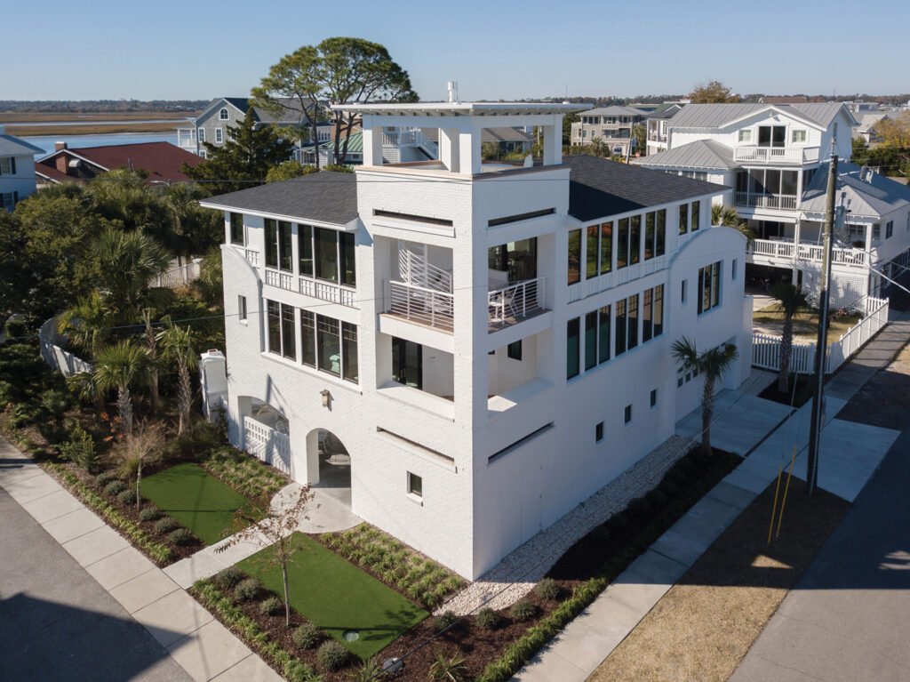
Facing the challenge of building on an irregular, triangle-shaped lot in Wrightsville Beach, a visionary design team showed that necessity can truly be a catalyst for successful innovation. With a three-story foyer that feels like an atrium, an open interior with high ceilings, and an array of outdoor living areas, the result is a coastal retreat that lives much larger than the listed square footage.
In early December 2021, a search for 2 Point Place on Google’s Street View would unearth a photo from November 2013 showing the small 1930s-era single-story home on Harbor Island that formerly occupied the site.
To gain additional square footage, lead architect Anna Dietsche and the custom home builders from Gwathmey Residential Group started by relocating the address to Point Place from Lindy Lane, the intersecting street. This allowed for a smaller setback for the new residence, and the chance to enjoy views of Banks Channel from more of the rooms.
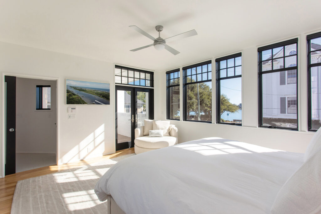
Additionally, the design team utilized the maximum allowed height of 40 feet to accommodate three floors. Tower porches were integrated at the elbows of the upper floor plans, allowing for views from both the indoors and outdoors, and long window expanses were used to provide every bedroom and living space with oblique views, at minimum.
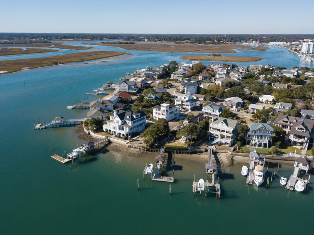
A reverse floorplan with most of the living areas on the top floor creates a sense of spaciousness while simultaneously ensuring compliance with modern building codes, which required flood vents on the first floor to allow water to pass through during a major storm event.
“Anna Dietsche did an amazing job creating a great deal of living space given significant constraints,” says William Gwathmey. “When people walk into the house, they have a hard time believing how big the house feels related to the actual square footage.”
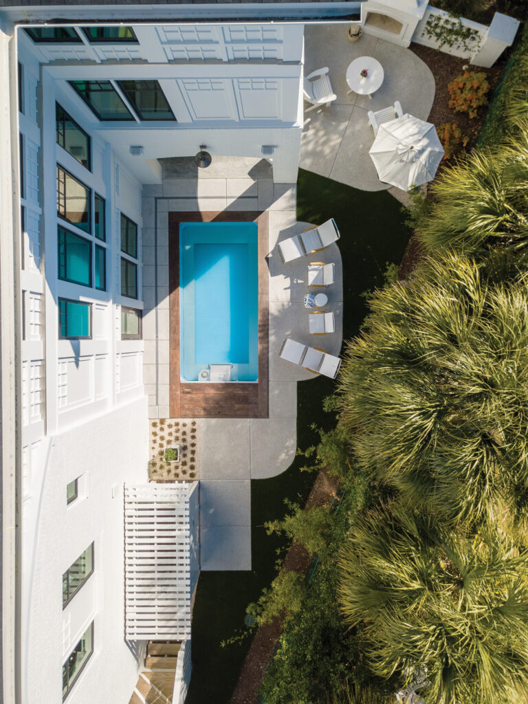
With a corner lot close to both streets, the owners had little privacy options. By integrating an L-shaped floor plan, the architect and builder created a sense of privacy for the back/side yard, where a stand of bamboo was planted to create a living privacy screen. Placing a solid wall with a few small, “punched” windows along the ground floor on the Lindy side was used as another means of providing a secluded outdoor space. The home becomes more open on the front, now on Point Place, welcoming visitors in a more formal fashion.
The front entry provides a wonderful option either to access the private back/side yard — which has an outdoor fireplace, a covered loggia, and an exercise spa — or walking into the foyer and taking the elevator up to the main living areas.
Walls of glass in the foyer extend to the ceiling, creating warmth and letting natural light inside, while a winding staircase entices people to climb all the way to the top level.
“We wanted to maximize this space without creating something that felt like a skyscraper, to keep it residential,” says Dietsche.
Palm trees, dwarf palmettos, hydrangea and giant liriope create a lush, dark green contrast with the white exterior. On the inside, white walls and dark windows provide a sculptural aspect to the home. All of this is tied together with the extensive red oak that was used for the staircase and flooring.
“The owners wanted something with a more contemporary aesthetic, without it being too slick or cold,” says Dietsche.
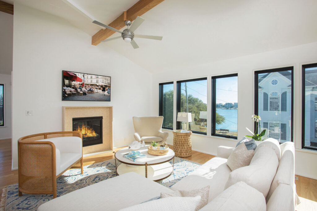
Numerous large windows make the light blues of the sky and the darker hues from Banks Channel feel like part of the interior color palette. Hardwood floors, a custom hardwood dining table, and a kitchen with an extensive use of stone also allow for a sense of connection to the natural landscape.
“We focused on implementing a simple design approach, with cohesive, unified spaces,” says Dietsche.
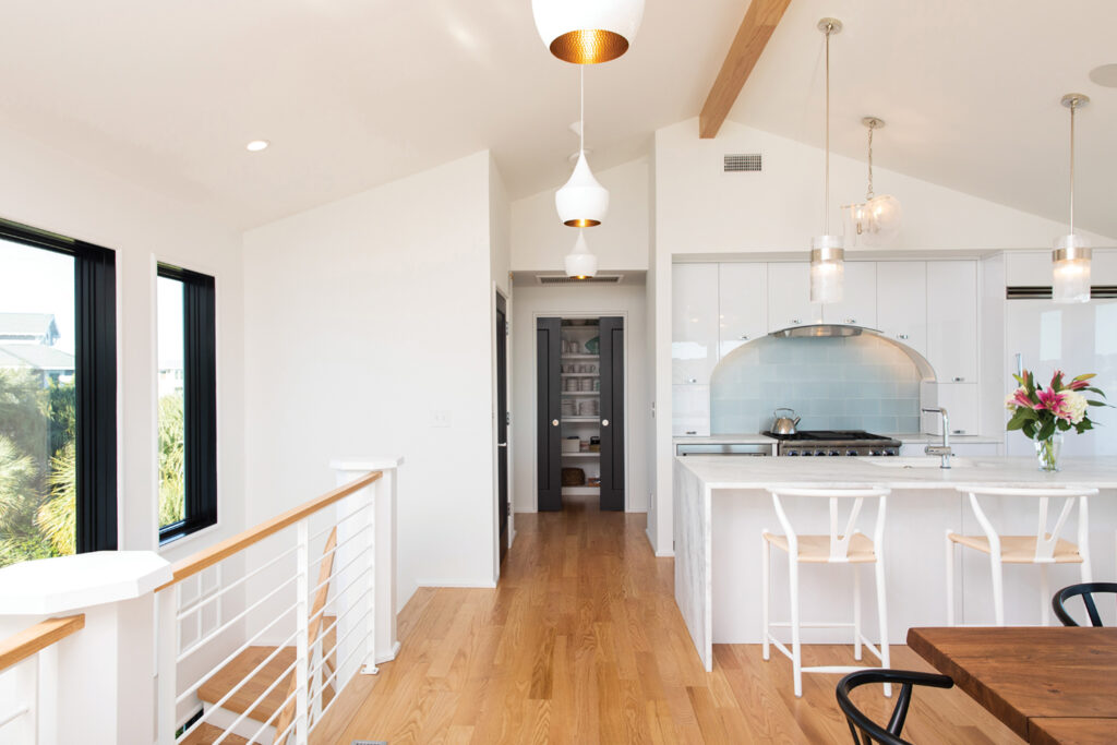
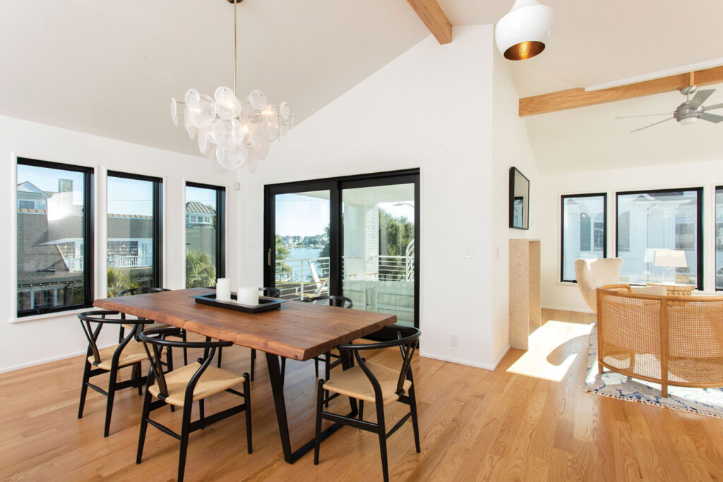
Distinctive light fixtures define various sections of the open concept dining room, living area and the kitchen, which is anchored by a large breakfast bar with counter seating.
“Ash Bell, Mike Miller and Jeremy Wilson, a few of our highly talented master carpenters, built all the cabinets in our workshop and did a remarkable job creating unique cabinets that really set this house apart,” says Gwathmey, referring to the kitchen. “Anna created a tall order with the cabinet design, and I feel our carpenters were able to hit the mark beautifully.”
The living area has a unique fireplace with petrified shells encased in the surround.
“Dustin Braudway’s team at Bluewater Surfaces fabricated all the stonework including the amazing waterfall kitchen island and fireplace surround, as well as the gravity-defying powder room vanity,” says Dietsche.
With four grown children, the owners, Ed and Donna Trice, had the idea of bringing everyone together for meals and quality time, so a large open space was necessary. One of the only exceptions to the open concept floor plan is the separate, walled-in home office near the living room, which has built-in desks for getting work done.
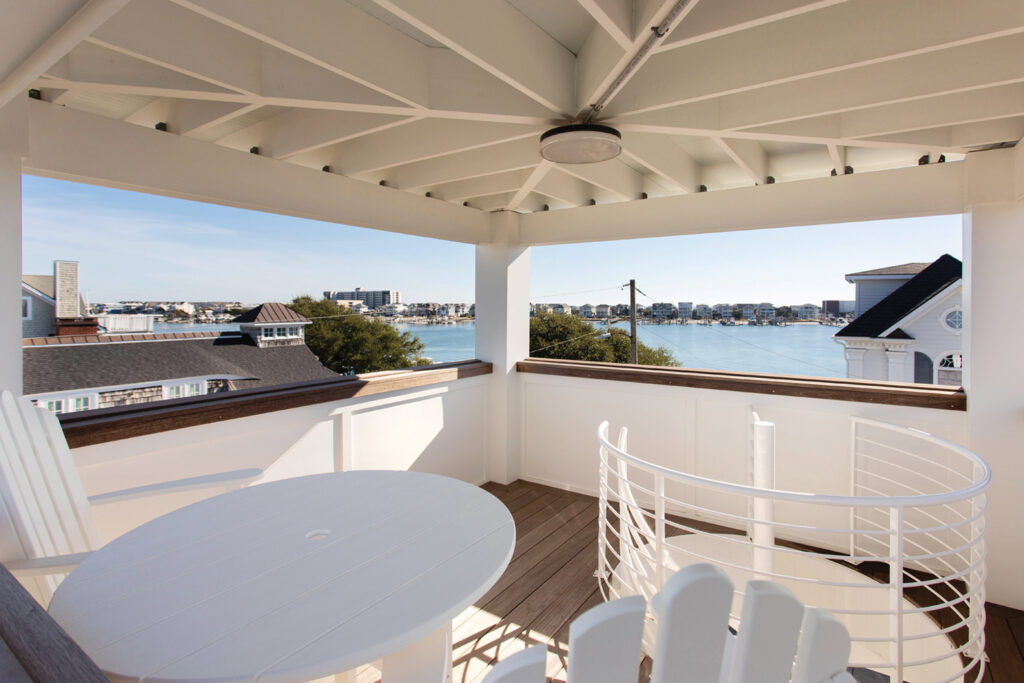
Focused on providing a seamless indoor/outdoor living experience, the main living area opens to a covered balcony. A spiral staircase affords access to a crow’s nest on the roof with panoramic, 360-degree views, something the owners decided they could not live without.
“The crow’s nest is simply a perfect spot to enjoy the breeze and views, as well as feel like you are away from everything,” says Dietsche.
By using frosted glass for the interior doorways, the architect and builders were able to create an expansive, open atmosphere without sacrificing privacy. Having one of the closets fully decked out with mirrors to allow one of the guest bedrooms to double as an exercise studio is another example of the innovative design approach that was utilized throughout.
“We just gave Anna some ideas, and she brought them to life,” says Ed Trice.
The architect and builders worked to ensure that every aspect of the home was low-maintenance. As a result, the residence features extensive artificial turf. The home also includes masonry wall construction with a brick veneer, reducing the need for exterior maintenance. This was allowable as new updates to the building code make it possible to use brick below the flood plain instead of exposed pilings.
“The owners really value simplicity. The advantage of only having white walls is that it provided them with a place to display their art collection without a distraction,” says Dietsche. “To add interest and break up the broad expanses of white, we integrated multiple textures throughout the residence, such as tile, stone, wood floors, black windows and doors.”
The home’s most interesting feature just might be the inventiveness that was required to make full use of the triangle-shaped lot.
“Chris Martin, the project manager, worked really hard to creatively solve problems,” Gwathmey says. “We are so pleased with the level of quality in the house and how well everything came together. Ed and Donna were a pleasure to work with, as they brought so much energy to the project and articulated their expectations graciously, which allowed us to complete this project on their timeframe and budget.”
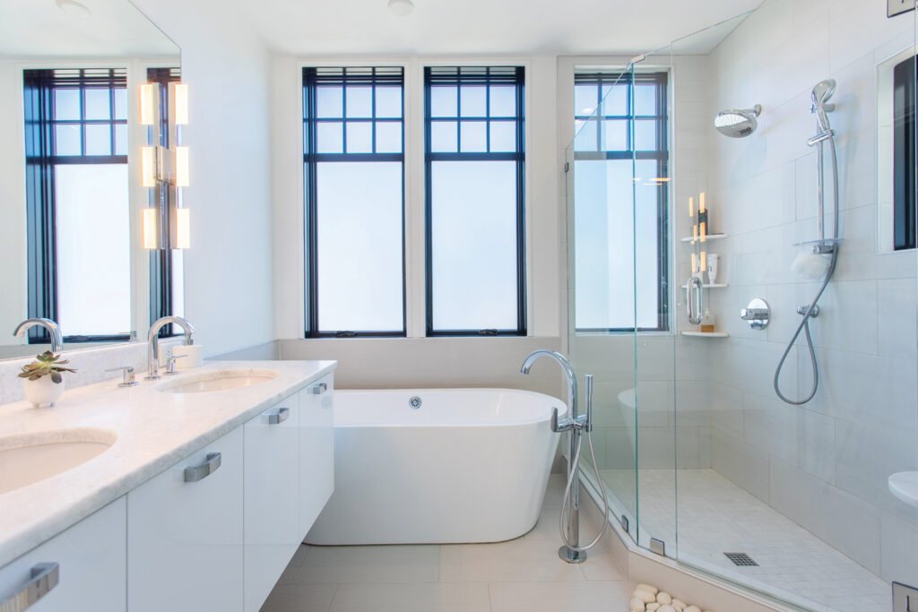
With an emphasis on transforming every inch of the property into a usable space, the vision and results produced by the architect and builders could serve as a paradigm for what is possible in the future, as the desire to repurpose many smaller coastal cottages is unlikely to decrease.
I watched this house being built so it was fun to read the back story and all that went into the architectural design of this killer house! A great read by Fritts Causby. And, that drone shot of the pool by Andrew Sherman is spectacular!